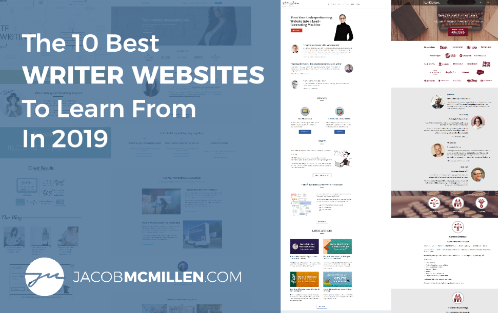
As a website copywriter, I’ve come across a lot of great writer websites over the 7 years I’ve been in marketing.
I figured I’d put together a quick little list of some of my favorites and get a nice easy post to kick off the year.
That was about a month and 5,000 words ago…
Whoops.
First of all, I made the mistake of naming this “10 Best Writer Websites” in my Google Doc, and apparently I take words like that WAY too seriously.
Secondly, I made the mistake of being sociable on Twitter heading into the new year, and I kept coming across new, amazing writer websites that simply had to be included.
Combine those two mistakes, and I’ve probably had about 40 different websites on this list at one point or another. In the end, however, my loss of time is your gain in quality. I’d stack these 10 websites up against any in the industry, and if you’re looking to improve your own website this year, you’ll learn a lot from them.
Even better, I was able to get one of my favorite writers on this list to join me for an interview and provide her go-to checklist for optimizing a writer’s website. Catch the video and checklist at the end of the article.
Okay, let’s get started!
Writer Website #1: Michal Eisikowitz
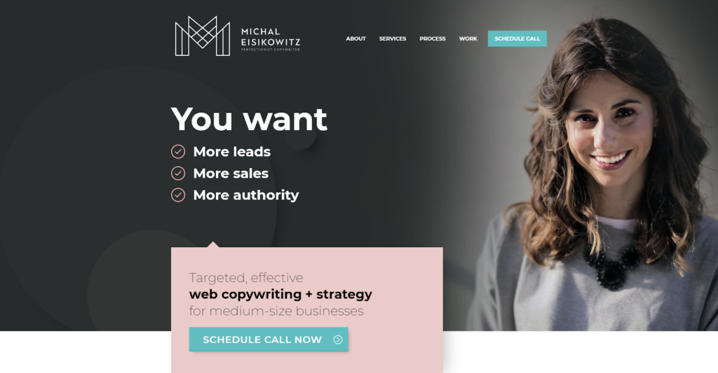
First on our list is this incredible example from Michal Eisikowitz.
Why This Is An Amazing Writer Website:
- Standout visuals and branding
- Specialized messaging targeted at high paying audience segments
- Uses real data to support expertise
From a visual perspective, this is probably the best-designed writer’s website I’ve ever seen. Every element of the site, from layout to graphics to images, is top tier.
The branding is phenomenal. The copywriting is specialized and targeted to appeal to knowledgeable marketers, entrepreneurs, and managers seeking top level talent (aka people who pay well). And the client data is displayed to really support the brand message of “Hey, I’m a top level talent. Look no further.”
Michal’s homepage is an amazing template for taking visitors through the sales process:
- Start with a benefits focused value proposition and immediate CTA
- Breakdown the customer segments you work with
- Provide a personality-rich introduction to your brand
- Bolster your pitch with plenty of social proof
- Breakdown the services you offer & their benefits
- Offer even more social proof
- Close strong with a bold CTA
You don’t need this exact order or every one of these exact sections to put together a great landing page, but Michal is doing everything right here.
I’d be shocked if Michal spent less than $5k on this website, and I wouldn’t be surprised if it was closer to $10k. As you will see through the rest of this list, you don’t need to invest anywhere close to that amount of money to create an amazing website, BUT if you want to see a gorgeous example of what’s possible with a hefty budget, this website is that example.
How This Website Could Be Further Improved:
As amazing as this site is, there are a few ways I think it could be improved:
- Add a follow-up to the audience segmentation (or remove it)
- Condense options on the service page
- Consider incorporating onpage SEO and adding a blog
I was very intrigued with the three audience profiles on the front page and excited to see where they led. After clicking on one and seeing the popup box, my first thought was “oh no, an unnecessary click”, and then after clicking the “Yes, this is me” button, I was horrified to simply see the box disappear with no redirect.
The #1 goal of audience segmentation is to create a targeted experience for each segment. In this case, segmentation isn’t actually happening, and Michal is asking for two clicks that lead nowhere. Unless Michal is wanting to create separate landing pages for each segment, I’d recommend removing the clickable elements and simply displaying the segment descriptions.
I’d also suggest drastically condensing the service page. It’s possible that this page receives a lot of orders and works well for Michal, but my guess is that she is operating mostly off referrals and this page doesn’t actually experience many orders. As a general rule, less is more, and you rarely want to give visitors more than 3-4 purchase options. At 16 options, all of which have to be customized anyway, this is just a crazy amount of overkill.
Finally, a site this great deserves to be seen, so I’d love to see Michal invest in some SEO and content marketing to get more visitors to her site.
Writer Website #2: Kayla Hollatz
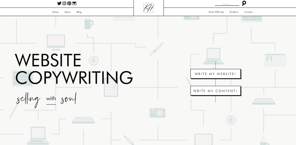
I actually came across this next example from Kayla Hollatz while checking my searching rankings. I had thought my top #10 list was already finalized at this point (LOL), but her site was so great, I had to change my list to include it, which started the whole snowball of changing and adding and changing and adding… thanks a lot Kayla!
Why This Is An Amazing Writer Website:
- Clean, beautiful, and personable design
- Great lead magnet in the form of a quiz
- Clear description of benefits offered
- Uses real data to support expertise
This site has a lot going for it. The design is very unique. It has an elegant but playful aesthetic. And it offers a pleasant user experience.
Most importantly, both the design and copy take the reader through an intentional narrative journey.
From a copy standpoint, Kayla goes all-in on personality. While she may not explicitly zero in on a niche, her messaging does it for her and is going to attract the types of clients who really resonate with personality and want to craft a personable narrative for their business.
Kayla also does a fantastic job of breaking down every angle of the benefits of working with her and includes the data to back up her claims. Furthermore, utilizing a quiz as her lead magnet serves to noticeably differentiate her and offer something outside of the box to potential clients.
This site was created by Kayla and her brother Zach Hollatz. She is the copywriter and he is the designer and developer, and they are now collaborating to deliver similarly epic sites for their clients, which I think is super cool. I’m not sure how much they charge, but between the copy and design, I’d guess it would be in the $5k-$10k range.
How This Website Could Be Further Improved:
There’s really not much I’d recommend changing for this site, but here’s some possible options:
- Hero shot could offer more information
- Testimonials could be better utilized
While the hero shot (the screen view you see when you first arrive on the site) looks amazing, it ultimately doesn’t say a whole lot. “Selling with Soul” is a nice tagline but doesn’t serve as an actual value statement. If the bounce rate is very low, it’s probably not worth changing anything, as incoming visitors might be happy to click through to either service page or begin scrolling, but if the bounce rate is around 50% or higher, fleshing out the hero shot with a true value statement is the first change I’d look to make.
The only other comment I’d make is that Kayla has some amazing testimonials, but from what I can tell, they are all buried at the end of her copywriting page. Spreading these throughout the site would be the icing on the cake to finalize the fantastic copy and design. Testimonials are very, very powerful in the service industry, so I’d definitely recommend getting hers incorporated throughout the site.
Writer Website #3: Nandini Jammi
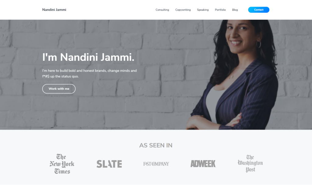
The best word that comes to mind for this next example from Nandini Jammi is “impressive”.
Why This Is An Amazing Writer Website:
- The messaging is impressive
- The social proof is impressive
- The photos and graphics are impressive
- The layout and flow is impressive
You know from the moment you arrive on her page that Nandini Jammi isn’t just another copywriter.
She introduces herself as someone “here to build bold and honest brands, change minds, and f*#$ up the status quo,” with a background photo that says, “It’s in your best interest for me to run this meeting.” Her introduction is packed with industry-leading brands and publications. Her portfolio includes numerous brands you’ve actually heard of.
Everything is done at a high level, and when you land on Nandini’s site, you feel like you’ve just been introduced to someone who really gets shit done. It’s a case study in great personal branding.
Moving past branding, Nandini hits all the key points on her service pages. Her copy is niche targeted and extremely benefits focused. She is very clear and specific in everything she says, and you get the feeling in reading her copy that if you hire her, she’s going to come in with a very clear gameplan to help you get the results you need.
Out of all the sites on this list, this one probably hit me with the best first impression, yet unlike the previous two, you won’t need a $5k+ budget to try and emulate this site, which is built via a Wordpess theme and plugins. Nandini might have put this site together herself (like I did for my website) or had a designer do it at a fairly reasonable cost.
What this clearly shows us is that if you are a talented copywriter with an amazing sense for personal branding, you don’t need a bespoke website design to create a truly impressive website experience. In fact, the rest of the websites on this list are all created using WordPress themes or similar website builders.
And while it’s unlikely that you will be able to create quite the same impression as Nandini, you can use your own sense for personal branding to create something that is even more impressive and captivating than the sum of its parts or the dollars in its budget.
How This Website Could Be Further Improved:
I’m really reaching here, but if I had to come up with something to improve, here’s what I’d do:
- Even out white spacing on service pages
- Commit to one service as the “primary” service
Again, this is very low priority, but while the homepage spacing is perfect, the sections feel a bit cramped in certain spots on the services pages. Evening those out would complete the look.
And while this may or may not be an actual improvement, I’d really like to know which of Nandini’s services she most wants me to order. They are presented fairly evenly and the way she goes about selling herself doesn’t really indicate one direction over the other. Is she a speaker who also offers consulting and occasionally writing? Is she a consultant who offers writing and occasionally speaks? I know there has to be some form of hierarchy there, and it’s possible that expressing that hierarchy on the site would serve to better direct clients toward whatever the preferred service happens to be.
Writer Website #4: Chidinma Nnamani
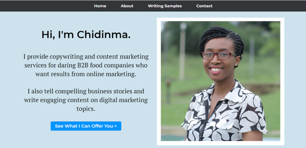
Now, after the last three sites, you might be thinking, “These look great, but even using a WordPress theme, there is no way I could create something like this. Maybe I just need to wait until I can hire a designer.”
This is why I’m so excited to share this beautifully simple example from Chidinma Nnamani that demonstrates just how exceptional your site can be using nothing more than a stock WordPress theme, 1-2 photos, and some kickass copywriting.
Why This Is An Amazing Writer Website:
- Very simple, clean, pleasant design
- Highly specialized niche focus
- Clear, straightforward copywriting
- Streamlined navigation with easy access to all pages
This website is both an incredible example of highly specialized niche focus and the perfect template for a new copywriter looking to build their first site.
The design is simple and clean, and you would have no trouble creating a similar looking site using WordPress or other popular platforms.
The copy is conversational and straight to the point and tells potential clients exactly what they need to know. Chidinma uses a straightforward, easy to emulate formula for her copy: “I provide [this service] for [this type of client] who wants [these benefits].”
A lot of new copywriters wait forever to set up their websites because they think it has to be complicated. They think they need a custom design. They think they need to rewrite the book on copywriting. They think they need to be all things to all people.
Wrong, wrong, wrong!
Chidinma’s site doesn’t feature $5,000+ bespoke design or an incredibly inventive sales pitch, and yet it is just as good as the more elaborate, more expensive sites on this list. It does EXACTLY what she wants it to do: it clearly communicates here expertise to the specific audience she is targeting.
Don’t over-complicate it!
Find a simple theme you like. Get a good quality, professional photo of yourself (if possible). And then tell your prospective clients exactly what you have to offer them.
How This Website Could Be Further Improved:
This is another site where there aren’t any notable problem areas, but the following changes could further improve the site:
- Improve visual flow for text areas
- Create a niche-specific lead magnet
While the overall design is very clean and pleasant, the typography could use some work. Things get a little “wall of text”y in certain areas, which distracts a bit from the otherwise clean flow. The easiest way to improve these areas would be to break up the spacing, either through editing the stylesheet or simply adding additional spaces between sections, headings, etc.
The other thing I would recommend is creating a lead magnet that really serves to establish her unique experience in the B2B food industry. In my opinion, the more niche your target, the more effective lead magnets tend to be for you, so I’d love to see something along the lines of “The Top 6 Content Mistakes Made In The B2B Food Industry”.
Writer Website #5: Kaleigh Moore
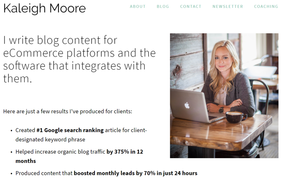
Next on our list is this delightfully minimalist example from copywriter Kaleigh Moore.
Why This Is An Amazing Writer Website:
- Highly specialized messaging
- Fantastic testimonials and use of testimonials
- One of the best newsletter signup pages I’ve ever seen
- Simple, well-organized site structure and navigation
Kaleigh’s messaging is another really great example of niche focus and simple, minimalist design. A lot of new writers are afraid to say, “I only work with these types of businesses”, but sites like Kaleigh’s do well precisely because of that. If you are looking for ecommerce copy or SaaS copy related to ecommerce, you are going to resonate a lot more with Kayleigh’s messaging than what you find on my website or any of the other sites on this list.
Moving beyond the copy, Kaleigh has one of the best newsletter signup pages I’ve ever seen. There is something really powerful about letting the reviews/testimonials speak for themselves. Testimonials are also used well throughout the entire site. They are visually appealing and most importantly, content relevant.
Kaleigh’s site is also a really great example of content organization, something that new freelancers often get wrong. She has 6 total pages. None are unnecessary. None are too long. All are easily accessible. Emulate this!
How This Website Could Be Further Improved:
I think there are a few things Kaleigh could do to improve the way this site feeds leads to her business:
- Make the homepage topic and CTA consistent
- Offer a fuller breakdown of her copywriting service
Kaleigh offers this really great (albeit brief) pitch for her copywriting services on the homepage and then… invites people to sign up for her newsletter… without any invitation or call to action to actually hire her!
It’s possible she’s decided that email subscribers are more valuable to her than service inquiries, but in my experience, the best copywriting clients are not looking to get on a list and build trust. They are looking to hire someone immediately.
It’s also possible that Kaleigh would prefer to get coaching clients but feels obligated to pitch her copywriting expertise on the homepage. If this is the case, I’d recommend changing the homepage to speak more to the coaching and career expertise she brings to the table, keeping the email signup as the main CTA, and then creating a separate landing page focused on her copywriting services.
If that’s not the case, I’d recommend fleshing out the homepage with a bit more about her services (given she doesn’t have a service page) and then doing a really strong CTA to hire her directly.
Writer Website #6: Aaron Orendorff
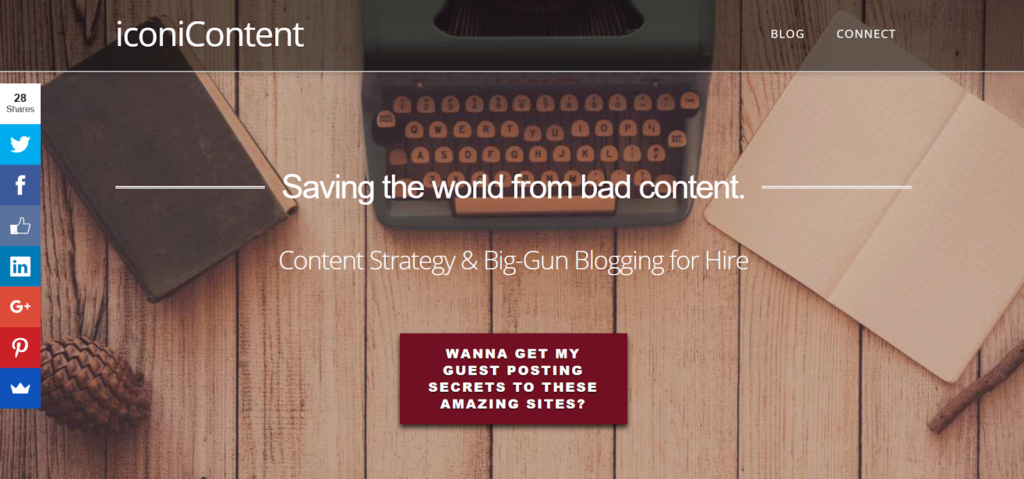
Next on the list is this stellar example from the always stellar Aaron Orendorff:
Why This Is An Amazing Writer Website:
- Strong branding and social proof
- Clean, well organized design and typography
- Linear user experience
- Strong headlines and CTAs
Aaron is a force of nature, and his site does a great job of giving us a small glimpse into the maelstrom that is his writing services.
While you and I probably can’t get away with a tagline for our value proposition, it works perfectly for Aaron. “Saving the world”… “Big Gun Blogging for Hire”… these types of phrases don’t work for 99% of writers, because 99% of writers can’t follow them up with testimonials from 4 of THE biggest names in content marketing.
Aaron’s writing is consistently the top performing content on the blogs he writes for, and because of this, he doesn’t need to compete with other writers. Instead, he purposely differentiates himself with grandiose claims, because:
- He can back up those claims with data and social proof
- He only wants clients who are looking for (and willing to pay for) the best.
Aaron and his website, as well as the next two websites on this list, are perfect examples of writers who have gotten to the point in their careers where they can begin to break the rules a bit. This is ultimately what you should be aiming for in your writing career:
“Learn the rules like a pro so you can break them like an artist.” – Pablo Picasso
How This Website Could Be Further Improved:
Aaron has already improved this landing page over the years to the point of being near-perfect, but if I had to offer some suggestions, they’d be the following:
- Better utilize the insane data I know he has available
- Invest more in his blog
I know firsthand that Aaron has some really crazy data he can share about his blogging performance. Some of it is mentioned and alluded to in the testimonials, but if he wanted to, he could display some pretty impressive numbers next to each service listed, and I think doing so would further improve the page.
Moving past the homepage, I’d love to see Aaron invest more in his own blog. Similar to myself, I know his client work takes up so much of his time that he just can never seem to get around to it, but he has the groundwork laid to be a very explosive player in the marketing/business/writing education niches, and I’d love to see him go after that.
Writer Website #7: Crystal Dunn
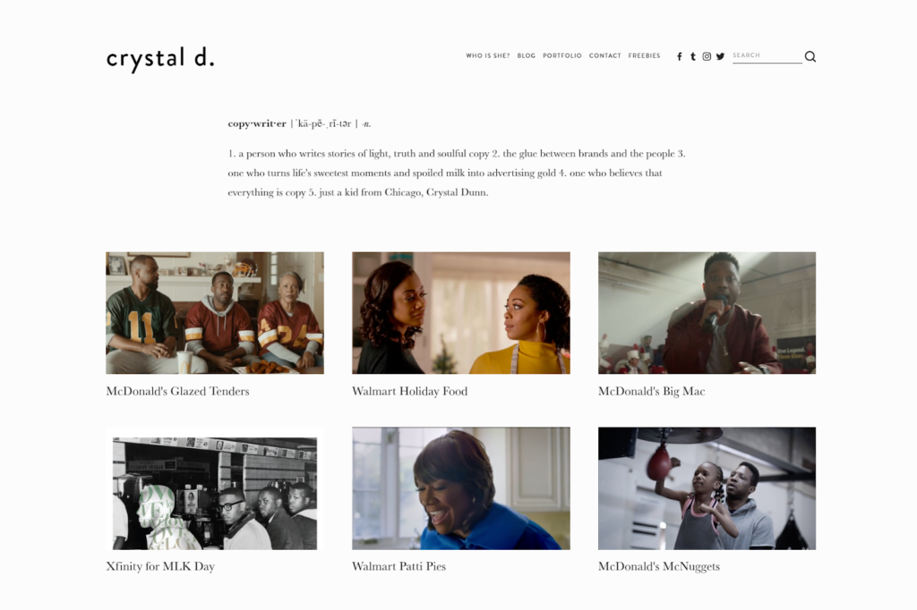
Next on the list is this charmingly creative example from Crystal Dunn.
Why This Is An Amazing Writer Website:
- Extremely creative value proposition
- Great visual presentation of portfolio
- Copy shows us the right way push creativity without sacrificing persuasion
Crystal’s value proposition has to be one of my favorites of ALL TIME. There are so many levels here, the first being that the average Joe doesn’t know what a “copywriter” is. Doing a pseudo definition is just absolutely brilliant!
But even beyond that, Crystal uses this to offer an incredibly personal introduction to who she is and what she brings to the table.
I especially love the line “the glue between brands and the people”. While that might sound vague to somebody outside her industry, it’s actually incredibly targeted within the industry. Crystal isn’t working with mom and pop ecommerce stores, and she’s not writing direct response copy for emails or landing pages.
Crystal’s focus is on writing TV and radio advertising campaigns for major brands, and bridging the gap between the boardroom strategy and the end user is precisely what these brands struggle with. So not only is she introducing us to her personality within this value proposition, she’s also telling her target client that she can solve the exact problem they need help with.
Moving past the value proposition, we see a cleanly presented visual portfolio with images that capture the the mood and focus of the campaigns, and subtext clearly displaying the massive brands Crystal has worked for.
What I love about this site is that it shows us how to really push the boundary on creativity without sacrificing a bit of functionality or persuasion. The artistry isn’t trying to hide ambiguous copy or a directionless site. Instead, it enhances an exceptionally focused and impressive website with Crystal’s personal flare.
How This Website Could Be Further Improved:
The fact that Crystal’s niche is very different from mine means I have much less footing to offer critique.
For example, a resume might be THE path to getting gigs in her niche, whereas it is virtually meaningless in mine. If it’s not the standard way business is done, I’d recommend directing the opening CTA to the contact page and maybe incorporating the highlights from her resume in a sidebar on the contact page or something along those lines.
It’s also possible that hard data from campaign performance isn’t something that gets shared in her industry, but if she does have access to any of that data, adding it to the site would be a huge plus.
The only concrete recommendation I can make would be to go in one of two directions with her content:
- Really go all in on the current lifestyle direction – career, self-care, dating, faith,etc – and make building that audience her primary focus
- Keep copywriting services as the goal and focus her content more specifically in the career/self-care/personal development direction, which would cross over better with copy clients
Right now, I feel like the blog is just a bit disjointed from the rest of the site. I think that either building it out as a full-on content marketing effort or bringing a lesser amount of content more in alignment with her services would be more beneficial to her business.
Writer Website #8: Brittany Berger
Next on our list is this super fun example from Brittany Berger.
Why This Is An Amazing Writer Website:
- Catchy headline and homepage copy
- Very unique value proposition
- Great multimedia and lead magnets
- Fantastic about page
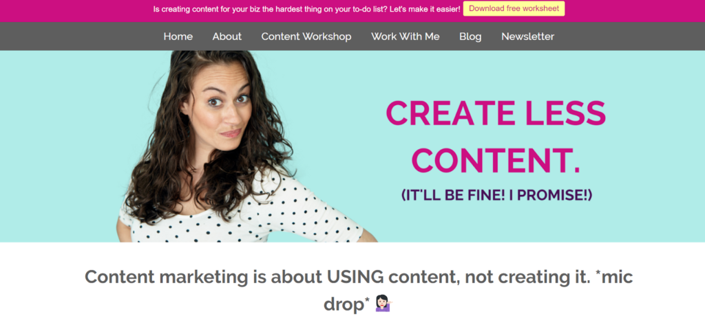
You know that Brittany and her brand are unique from the moment you land on the page. From the sassy expression to the emoji usage to the bold opening lines, this homepage immediately grabs your attention… and that’s not easy to do.
What I love about this is that she has turned a simple service – content repurposing – into a really surprising headline.
Put yourself in the shoes of someone looking to hire a writer. Imagine showing up to a website with a headline that says, “I repurpose the content you already have to make you more money.” That’s not bad, but it doesn’t really grab me, and since it’s a bit of an alternative proposition from what I was looking for, I might just bounce and continue my search.
Brittany’s headline, however, is going to catch my attention: “Create Less Content (It’ll be fine! I promise!). And right under that – “Content marketing is about USING content, not creating it.” If I’m here for a writer to help me with content marketing (Brittany’s target customer), this is a tremendous hook.
How This Website Could Be Further Improved:
The follow up to Brittany’s hook is where I think some things could be improved.
- Explain the benefits of less content on the homepage
- Add a CTA to hire Brittany for content marketing on the homepage
Now that Brittany has provided one of the best hooks on this list and gotten the prospect intrigued and scrolling, it’s time to really pitch the value of her “less is more” approach.
Instead, she mostly focuses on what others are doing wrong, without really explaining why her approach is better. Additionally, she ties her minimalism to laziness, which is obviously a bit tongue in cheek and might vibe with certain people, but I personally feel this where she should be hard selling why her approach is better and why hiring her and her minimalist approach is going to save money and increase revenue for her clients.
And then, she should immediately invite people to contact her or hire her!
Writer Website #9: Tyler Koenig
Next on our list is this crisp, engaging example from Tyler Koenig.
Why This Is An Amazing Writer Website:
- Uniquely colorful and vibrant website
- High quality images that highlight Tyler’s personality
- Minimalist design focused on content
- Has the feel of a breakout multimedia brand in the making
This website is a bit different on this list in that I don’t actually think it’s fully realized yet, BUT I think it’s doing some things really well that no other websites on this list are doing.
For starters, every other site on this list relies on white space (or off-white space) to background their message. White space is safe. I recommend it. And if you had asked me a week ago whether or not it’s a mandatory part of a good site, I would have emphatically said “yes”.
Then Tyler comes along and slaps his background full of yellows and oranges… and it’s f*cking amazing.
Everywhere you go on Tyler’s site is framed with this unique, captivating orange that is just so much more of a brand statement than the more neutral tones the rest of us rely on. It’s very fitting with the visual brand he brings to the table.
His pictures and videos are well produced, personable, and packed with useful information, whether it’s the personality coming through in the images or the valuable insights coming through in the videos. And I could listen to this guy’s voice for hours.
If you resonate with Tyler’s sense of style and use of color, this site serves as a great encouragement that you can pull it off. You don’t have to default to neutral tones. You don’t have to hang your entire pitch on written content. The skills of persuasion can be applied as readily to any media form as they apply to writing. Don’t limit yourself!
How This Website Could Be Further Improved:
My biggest recommendation for Tyler’s site is “more”:
- Spend some more time fleshing out the value proposition
- Add more copy to the home page and the “Work With Me” page
- Add more CTAs so people can easily hire Tyler or subscribe to his content
Tyler’s brand has the feel of a multimedia brand in the making, but it needs more. It’s not quite fully realized just yet. I’m definitely looking forward to seeing where he takes his brand.
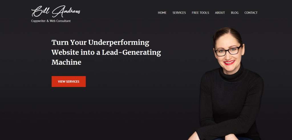
Writer Website #10: Gill Andrews
What better way to round out this list than with website-tips extrordinaire Gill Andrews? Gill recently posted the 100th tip in her amazing ongoing website optimization series on LinkedIn. I’ve learned quite a bit of useful nuggets from her series, and her own website is a no-brainer for this list.
Why This Is An Amazing Writer Website:
- Uses a value/benefits focused headline
- Great use of testimonials
- Highly relevant lead magnet
- Lots of touchpoints, which are prioritized correctly
I’m probably a bit biased given how closely it resembles my own homepage value proposition, but Gill’s opening value proposition is exactly what you want for a landing page. It is action-based, value-focused, and explicitly describes the benefits being offered.
There’s only so much you can say in a single value statement. One interesting thing Gill does is use her testimonials to both re-enforce her value statement AND specify her core service. After you read the opening headline, you know that Gill is here to help your website make more money. After reading the first testimonial, you know how she does it: via a website review.
This is great example of just how intentional you can (and should) be in arranging a landing page. You shouldn’t simply string together a collection of sections. You want to craft an intentional, relatively linear journey for your readers.
Typically when you see someone includes a lot of different touchpoints ALL on the same page – services CTA, about page CTA, blog posts, video, lead magnet, etc. – it’s a distracting mess, but Gill actually makes it work by prioritizing the touchpoints correctly and offering that linear journey.
- First and most importantly, she leads with service CTAs.
- Next, she includes her About section and CTA for people wanting to dive into her credentials before moving forward (her about page then offers a CTA, which is very important).
- Next, she invites visitors to sign up for her highly relevant lead magnet that directly supports her core service offering.
- And finally, she allows people to engage directly with her blog content and video content.
This is THE correct order in terms of best practices if you want to add all of this on the same page, so bookmark her website for future reference.
How This Website Could Be Further Improved:
I only had one recommended change for Gill’s site, and it was a big one, and I was so excited to share it and be able to teach something to the master herself… but by the time I published this post, Gill had already identified the problem herself, fixed it, and made it even better than what I had suggested in my recommendation.
I’m left with literally nothing to put here anymore… so um, here’s a penguin with a briefcase.
Interview With Gill Andrews + Website Checklist
After I had finished this post, I messaged the website master herself to see if she’d share some thoughts, and she was kind enough to do a 30 minute interview going through her personal checklist for what to look for when evaluating a website. There are some really amazing insights here, so check it out:
To review, here is Gill’s checklist for evaluating your website as a writer or service provider:
- Clearly say who you are and what you do
- Tell them how it works
- Tell them how much it costs
- Prove that you’ll do a good job
- Make sure it’s easy to get in touch with you
- Write like you are talking to someone you know
If you’d like to get some feedback on your own website, comment below with your website URL and say one thing you think you are doing well and one thing you think you need to improve (comments with just a URL will be removed).
Enter your email below to grab the templates.