The Complete Guide To
WEBSITE COPYWRITING
In this guide, I’m going to teach you my step-by-step process for writing high-converting website copy.
I’ve used this process on hundreds of websites over the last decade, and it can be applied to any business in any niche.
So if you want to learn how to:
- Plan out a wildly effective website
- Write persuasive copy from scratch
- Get more leads, subscribers and sales
Then this is the guide for you.
This isn’t a collection of tips, tricks, or techniques. This is a complete process for turning a blank page into the type of website copywriting people will pay thousands of dollars to acquire for their business.
If that’s what you’re looking for, let’s get started.
(Click here if you’re jus trying to hire a website copywriter)
What We’ll Cover In This Guide
(Click To Navigate)

Chapter 1
The Blank Page Startup Plan

Chapter 2
Website Copywriting Essentials

Chapter 3
How To Write A Homepage

Chapter 4
How To Write An About Page

Chapter 5
How To Write A Service Page
Chapter 6
How To Write A Product Page

Chapter 7
How To Write A Contact Page

BONUS
Live Templates & Walkthrough
Want To Skip Straight To The Templates?

I’ve turned the 5 key website pages discussed in this article into “live” templates you can use to easily visualize, plan, and write your web pages.
With these templates, you can skip that blank page paralyzation stage and get rolling with your copywriting. It’s the perfect website reference!
Click below to access all 5 templates and skip reading through this 10,000 word guide:


CHAPTER 1:
The Blank Page Startup Plan
Everyone knows the sinking feeling of looking at a blank page and wondering, “What now?”
This can be especially daunting on a website, where there are numerous factors and objectives to consider.
Fortunately, putting together a website copywriting plan is much easier than it sounds.
In this section, I’m going to show you three simple steps to go from blank page to website masterplan. This process works for any website and any niche.
(If you already have an ironclad plan for your website, feel free to skip to the next section.)
Identify Your Site’s Most Important Objective
A website is a tool, and in order for it to be effective, it needs to be built and used for a specific purpose.
What is your website’s purpose?
To answer this, consider your business type and where the website fits within your broader customer journey.
- If you have a service business, you will probably want visitors to fill out some type of contact or lead form.
- If you have a product business with a shorter buyer cycle, you will probably be seeking a direct purchase.
- If you have a product business with a longer buyer cycle, you might prioritize email signups so you can engage leads in an email nurturing process.
Whether it’s one of these options or one of a wide list of other potential objectives, what’s important is that you identify a singular objective for your website. You can have a few secondary objectives as well, but you need a single, primary objective for your site, or you will dilute your site’s ability to perform for you.
Decide How To Use Your Homepage
Our goal is to get people from arrival to action as quickly as possible and in the most linear way possible. In order to do this, we want to minimize the number of pages included in the customer journey.
Option #1: If you only offer a single product or service, that makes this really easy. You will use your homepage as a landing page for that product or service. This gives us the possibility of a one-click customer journey. They can arrive on your homepage and convert without needing to visit another page.
If you have multiple products or services, things get a bit trickier. If one of your products or services accounts for 70% or more of your revenue, I recomend sticking with Option #1 and using your homepage real estate as a landing page for that main product or service.
If revenue is more distributed, then we have two additional options.
Option #2: If your primary website objective is email signups, use the “Upside Down Homepage” technique to maximize signups.
Option #3: If your primary objective is anything other than email signups, use your homepage as a “Brand Building” page.
We’ll cover all three of these options in the following chapters.
Decide How Many Website Pages You’ll Need
Your homepage and service/product pages are where the money is going to be made, but you might need some other pages as well.
The keyword here is “might”. It’s rare for me to come across a website and think, “Damn, they could really use a ______ page.” On the other hand, I come across websites every single day that have more pages than they need.
I always recommend having an about page and contact page, primarily because people expect them, and navigating to these pages are a standard part of engaging with a website for a large segment of consumers.
If you want to add a page beyond those two, first ask yourself, “Does this page increase the likelihood that visitors will meet my website objective?”
For example, you might want to add a testimonial page. Ask yourself if requiring the visitor to click away from your service page in order to view testimonials will increase the likelihood that they meet the website objective? It might, or it might be better to incorporate testimonials directly into your service page.
There aren’t any objectively right answers here. It’s just a guess until you collect user data. But as a general rule, we want to reduce pages and make the customer journey as a streamlined as possible.
By now, you should have a clear plan for the pages that will be included on your website. Now comes the fun part. It’s time to begin writing your website copy!
CHAPTER 2:
Website Copywriting Essentials
What is website copywriting?
Website copywriting is the process of writing “copy” – words designed to prompt action – for a website.
Even for talented writers, copywriting is an intentional form of writing that has to be learned and practiced. It’s a skillset that rarely comes easy.
In this section, we’ll quickly cover the 10 essential elements of great website copywriting.
These are fundamentals you may or may not have learned before, but whether this is your first lesson on copywriting, or you’ve been writing copy for 20 years, it’s always beneficial to get back to the fundamentals.

1. Always start by identifying the copy’s objective.
Before you write a word of copy, you need to identify the singular goal of the page or asset you are writing.
What do you want the reader to do after they read this copy?
Just like your website won’t be effective without a primary goal, any given page, asset, or segment of copy won’t be effective unless you know exactly what its overall goal is.
2. Always lead with the main point.
In addition to a goal, every page on your website will have a main point. For a service page, it’s the service value proposition. For the about page, it might be to establish credibility or resonate with readers around your mission.
Always lead with the main point. Research tells us that we have between 3-15 seconds (depending on the study) to grab the reader’s attention, so we don’t have time to bury the lead.
When your visitors land on any page on your site, they should be able to tell you the point of that page within a few seconds, without needing to scroll.
3. The goal of each line is to get the next line read.
Writing copy isn’t like writing a blog post. Every line… every word… needs to be intentional.
The #1 purpose of a line of copy is to get the reader to continue to the next line. If the reader does not continue reading, the message you want to tell them doesn’t matter. The points you want to make are irrelevant. And you can forget about the action you want them to take.
Website copywriting should take you longer word for word than writing a blog post, especially if you’ve been writing copy for less than 10 years. It’s not a natural process for most people to be intentional with every word, phrase, and sentence.
That said, don’t over-complicate this. Being intentional is not a particularly high bar. It just means that after you write a paragraph, look back through and ask, “Does this line move the narrative forward and motivate the reader to continue reading?” If not… change it.
4. Your customers’ needs and desires are the only thing that matters.
The main mistake that most non-copywriters make is focusing on their business, brand, or subject rather than the target audience aka potential customers.
When you think about your business, what you care about most probably makes no difference at all to your customers.
- In most cases, they don’t care about the income or lifestyle your business affords.
- In most cases, they don’t care about the unique technology that drives your business or how you developed it.
- In most cases, they don’t care about you or your business at all.
Like all people, they care about themselves and their own needs and desires, and your business is only of interest within the specific context of meeting those needs and desires.
That’s it.
And your website copywriting should reflect that. Everything should connect to those needs and desires, and if a piece of the message isn’t relevant to those needs and desires, it should nearly always be eliminated.
5. Write like you are speaking to a friend.
If you read the work of a new copywriter, it usually sounds like a kid pretending to be a business person. It’s randomly stiff, formal, and full of meaningless jargon.
I don’t know why this is the case, but it’s a near universal phase that most copywriters have to work through.
Good website copy reads like a well-spoken person talking to a friend. It has a casual, straightforward tone and gets to the point without rushing itself.
After you write a segment of copy, read it out loud and see if you cringe. Or better yet, wait a day and have someone else read it back to you out loud. If it sounds like you’re playing business, think about the main points you want to make and then imagine you are just telling those to a friend.
6. The most important element of copy is clarity.
Most copywriters and marketers like to make a big deal about persuasion and how magical persuasive copy is, but the truth is that the most important element of good copywriting is clarity.
Product/market fit is what sells things. Getting people in front of something they want or need is what sells things. The main job of a copywriter is simply to make it very clear to those people that the product is a great match for what they already want or need.
In most cases, copywriters are really only needed because the average person sucks at written communication. When left to their own devices, business owners and even marketers will create confusing, disjointed messaging in a misguided attempt to be persuasive.
It’s our job to come in and replace that confusion with clarity… via a simple, clear message that probably sounds a lot like the business owner’s verbal elevator pitch.
Unless your goal is to manipulate people via their fears or greed, ignore the side of the copywriting world that is always hyping persuasion. Persuasive writing techniques can be helpful, but if you are working with a great product or service that customers love, you don’t need persuasion, you need clarity. You need a clear, succinct message that shows the customer why the product fits their needs or desires.
That’s it.
7. Include the what, why, where, who and how.
We need to cover a few things in our website copy:
- What is the offer?
- Why does it matter?
- Where is it being offered? (if relevant)
- Who is it being offered to?
- How does it work?
Remember, though, the only thing that matters is our customer’s needs and desires, so how we communicate each of these things needs to be through that lens.
8. Incorporate proof and take your writing from the proof.
Proof is the true magic in website copywriting. Anyone can say, “I’ll do this for you.” But if you can follow that up with data, testimonials, examples, case studies, reviews, statistics, etc., that’s where you can really take things to the next level.
Even better, take your writing directly from the proof.
“Honestly, in this guide, you have put out more concrete actionable steps than over 90% of the experts have in their materials.”
That’s what one writer said about my writing guide, and it is so much better than anything I could say about my own product. It also gives me some really good phrases for my copy:
“Learn the concrete, actionable steps that both myself and hundreds of my students have used to hit six-figure freelance writing income.”
Incorporate the proof into your writing whenever possible, and take your writing directly from the proof whenever you can.
9. Anticipate and address objections, alternatives and sticking points.
This is a sales technique, and it’s one of the most powerful persuasive writing techniques you can utilize in your copywriting.
In interpersonal sales, whoever brings up the objection first, wins. If the customer says, “Hey but what about this _____?” any response is going to feel hollow, even if they have a good answer, and it will significantly lower the chance of the sale going through.
On the other hand, if the salesperson brings up, “Now you might be thinking this _____. Here’s how we solved that”, then it becomes a massive bonus toward pushing the sale through.
This concept translates to copywriting, but we have the advantage of a one-way conversation, which means all we have to do is address the objection, cover why we are better than the alternative, or downplay the sticking point at some point in our pitch.
This is another place where customer feedback is massively important, because we typically don’t want to bring up objections, alternatives, or sticking points that our leads aren’t already thinking about. We only want to cover the common ones (unless the solution is just such an over-the-top, no-brainer, smash-hit win that we can swat away all other options like flies).
10. Always be closing.
This last essential also comes from the sales world. Never over-pitch the sale.
You should be looking to close at every available opportunity, and on a website this usually means having regular calls to action (CTAs) at every point in your message where new info is presented and hammered home.
We never want to be in a situation where the reader is ready to act but then has to go searching for the button or action point.
A completely arbitrary rule of thumb is that you never want the reader to scroll past two screen’s worth of info without an opportunity to convert.
CHAPTER 3:
How To Write A Homepage
What time is it?
It’s time to write!
Let’s review our three homepage options:
- If you are using your homepage as a landing page for your primary product or service, skip to this section on how to write a service page.
- If your #1 website goal is to increase email subscribers, you’ll be creating an “Upside Down” Homepage (explained in this section).
- If #1 and #2 don’t apply to you, you’ll be using your homepage as a brand building and redirection page (also covered in this section).
By the end of this section, you’ll have a targeted homepage working on your behalf and helping facilitate an intentional customer journey.

The Upside Down Homepage
The “Upside Down” homepage is ONLY used when your #1 website goal is increasing website subscribers. Both the concept and moniker were coined by Growth Tools and focus on asking for the visitor’s email at the top of the page rather than at the bottom of the page.
Here’s how it works:
- The hero shot (visible part of page when you first arrive) includes some form of email signup.
- Immediately below the hero shot, show some social proof if possible.
- Then tell a brand story that descibes how you encountered a problem or challenge your readers are also facing… and how you solved it. The story should end with them being invited to give you their email in exhange for a resource you’ve created to help them solve that same problem.
- Make sure there aren’t more than 3-4 options in your topside menu. The fewer, the better.
That’s it! Easy peasy.
Here’s three good examples:
- My own homepage (here’s a jpg link, in case I change it down the road)
- Backlinko’s homepage
- Get Your Gusto Back homepage
Our brand building homepage is going to be comprised of 5 pieces:
- Brand value proposition
- Condensed brand story
- Social proof
- Redirects
- CTA
You aren’t limited to these pieces, and in some cases, you might not need all of them, but in most cases, this is what you want on your homepage.
The Brand Builder Homepage
The “Brand Builder Homepage” is my version of the classic homepage.
What do businesses do with their homepage when they offer multiple products or services, each with a difference pitch and target audience?
If they are smart, they will typically use their homepage as a “catch all” page and then redirect readers to one of their service or product pages, where they can engage with a more targeted, offer-specific pitch.
But it’s also important that these businesses are taking full advantage of that premium homepage real estate, so I like to use the space to make a great opening impression for the brand and drive home the unique value they bring to the table.
That’s what the Brand Builder Homepage is all about – selling the brand and then redirecting visitors to the right page.
Here’s how to create one.
1. Write your brand value proposition.
When people arrive on your brand-building homepage, we want them to immediately understand the point of the business.
Why does this business exist?
If they can’t answer that within about 5 seconds, the copy is failing.
For the basics of writing a value proposition, click here.
This is not a product or service value proposition. We probably won’t be talking about benefits or solving problems, unless those things define the business as a whole and everything it offers.
With a brand value proposition, we are focused specifically on the brand’s core identify as it relates to the target customer.
Here’s an example from a recent client of mine called sr4 Partners:
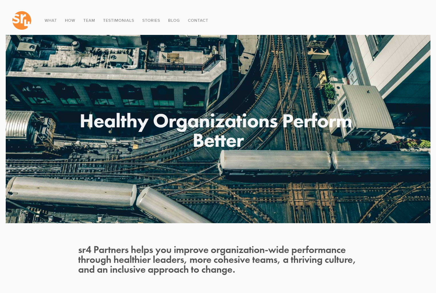
This agency’s core identity is built around making organizations healthier. They know that healthier organizations have better leadership, more satisfied employees, and higher productivity, but the challenge we faced was that “becoming healthy” isn’t the type of thing most business owners are actively seeking.
We needed to connect the organization’s identity to what the customer is consciously seeking, hence the value proposition headline: “Healthy Organizations Perform Better”
This is a really simple, compelling statement that immediately tells you what this business is all about.
That said, it still needed more. While it’s powerful, it’s also too vague if left on it’s own, and that’s why we immediately followed it up with a longer subheader that describes exactly what the business offers.
2. Write a condensed brand story.
The goal of our value proposition is to grab the right people by the hand and say, “Hey, hold up, this is exactly what you’re looking for. Stick around and see what we have to say.”
Now we need to say something.
This is where I like to hit ’em with the brand story. Not the long version that might fit on an about page or service page. We just want to tell them a condensed, quick-hit story of what the brand is all about.
The simplest way to write a brand story is to describe the challenge or problem your brand was created to solve and then talk about how you solve it.
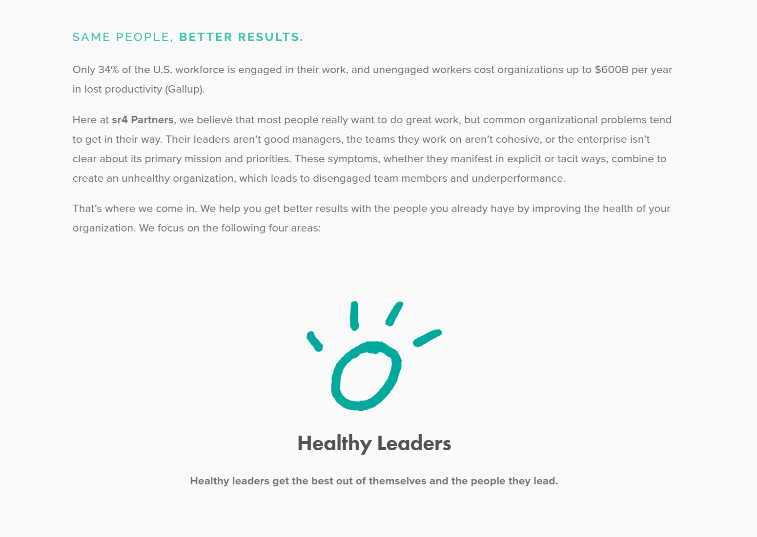
Continuing with the sr4 Partners example, we expanded on what was started in the value proposition – connecting organizational health to productivity and performance.
There are a lot of ways to do this, but remember, it’s not about you. It’s about the version of you that your customers most care about – the aspects of what you do that will most tangibly change their lives and businesses.
3. Show visitors your social proof.
When it comes to a brand building page, you really can’t overdo social proof.
After all, the entire point of social proof is to prove that what you are saying about yourself isn’t empty BS. The more social proof you have – and the more types of social proof – the better.
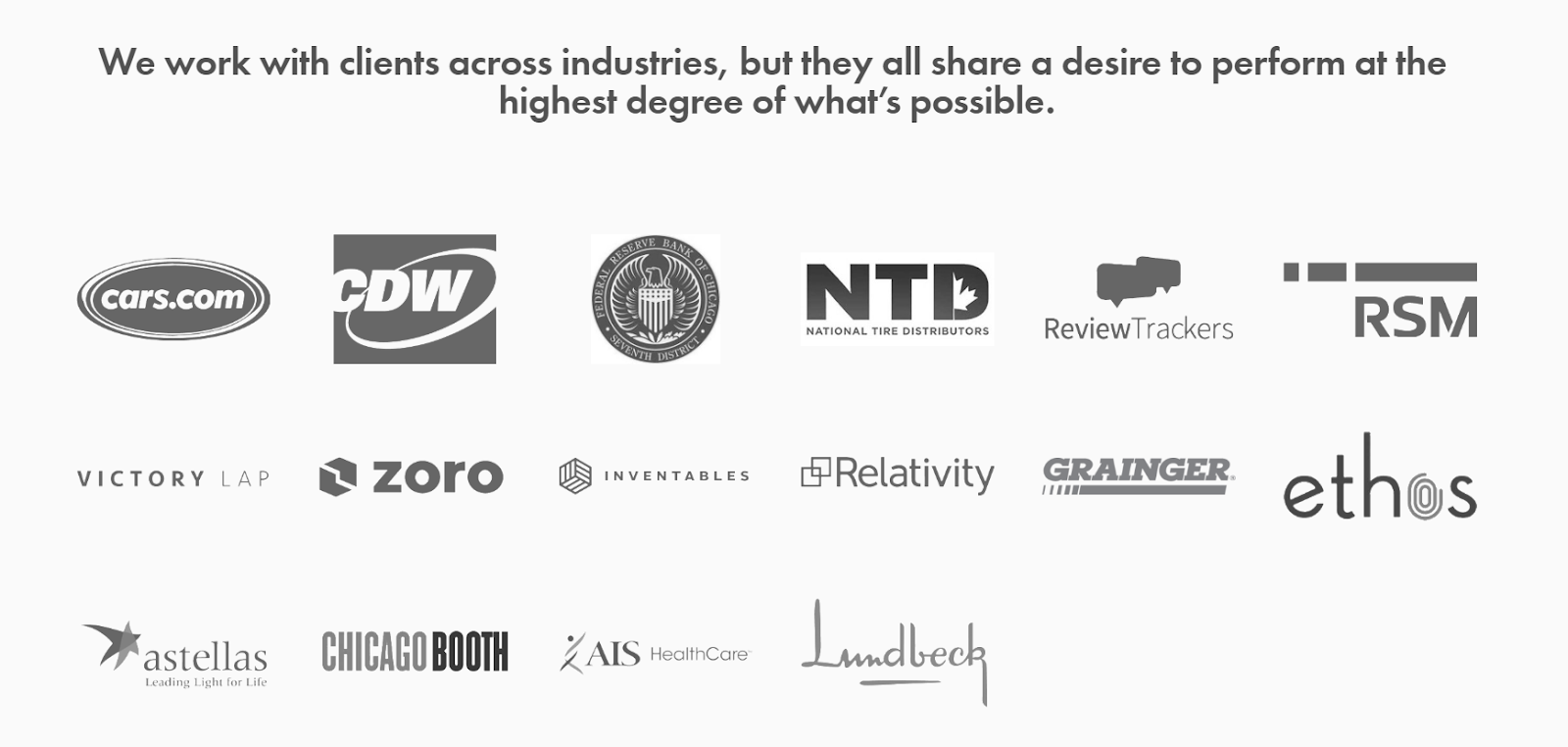
Highlighting the brands you’ve worked with can be really powerful, especially when visitors are likely to recognize the brands, and it’s a really easy way to quickly establish your credibility.
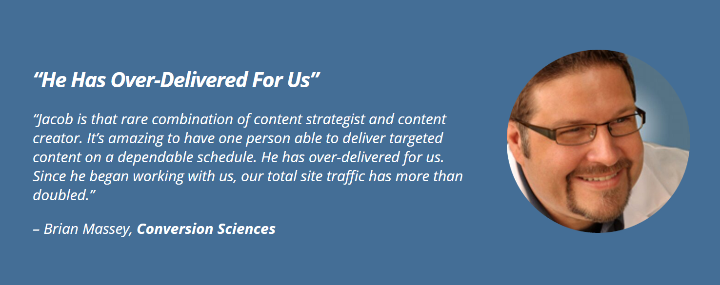
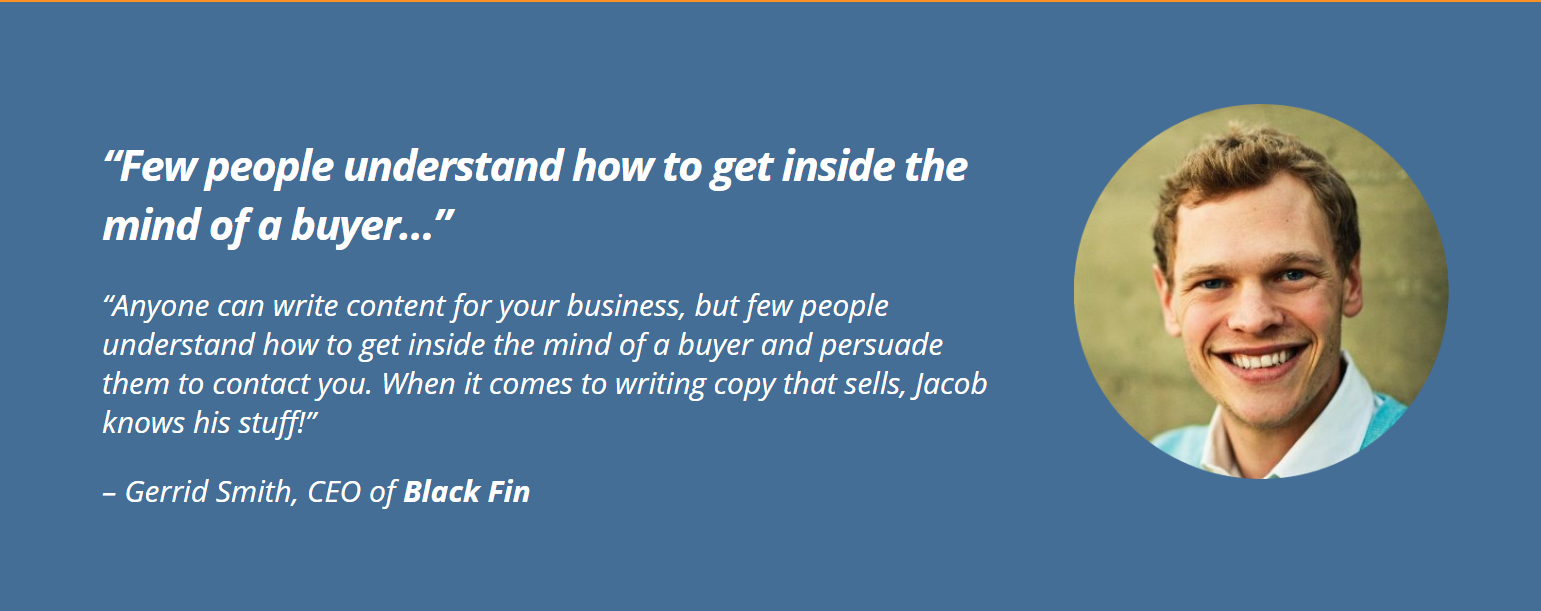
Testimonials that speak directly to the hopes and concerns of your potential clients can be particularly powerful. I like to take the hardest hitting line from a testimonial and use it as a headline.
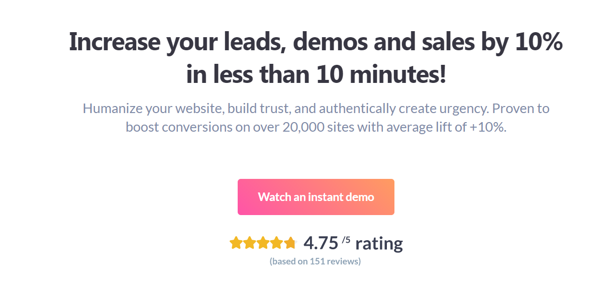
If you field reviews for your business, you can also display your review scores, either by displaying a sample of real, positive review or showing an accumulated review score, like in this example from Proof:
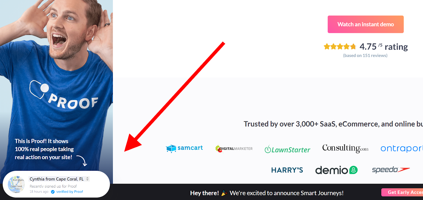
And speaking of Proof, live social proof in the form of a little pop up telling visitors that someone purchased, signed up, or otherwise converted recently is all the rage these days.
From what I’ve seen, these popups are especially powerful on landing pages recieving targeted traffic from paid advertising, but they can be added to any page:
You get the idea. If you have it, flaunt it.
The only other thing you have to decide is where you put this stuff on your homepage.
Ideally, you want to place available social proof wherever it is going to best enhance your message and contribute to the desired action.
I like to include at least one piece of social proof as early as the hero shot in order to immediately provide some proof that the business is legit. A “brand bar” – thin bar displaying 3-5 logos from the most prestigious companies you’ve worked with, does a great job of providing credibility without distracting from your message.
Next, I like to match testimonial content to copywriting content if possible. In other words, if I a testimonial talks about how the product benefited the customer, I’ll include it next to the copy section where we talk about how the product benefits customers.
I also like to make social proof visible at places on the page where I’m trying to motivate an action, since it acts as an additional push towards conversion.
There’s no single right answer here. Just try to think through where your available social proof would provide the most benefit and place it there.
4. Redirect visitors to the appropriate action page.
Since in this case, you aren’t using your homepage as a service, product, or signup page, your goal is probably to get visitors to one of those pages, so they can take action and meet your #1 site objective.
After all, telling people about your brand is great, but it’s not why you built the website.
You want visitors to take a specific action.
Yur homepage is serving as a catch-all page. Anyone who arrives for any purpose is immediately getting the elevator pitch for your brand, and then you want to whisk them off to the appropriate service, product, or other action page.
The only real question here is how many different places do you try to whisk people off to from the homepage?
One? Two? Ten?
First of all, the answer is never “one”. If it was, I wouldn’t be having you create a brand-building page; you’d use your homepage as a landing page for that singular objective.
Past that, it’s a judgement call, but like with everything on your site, less is usually more.
If you have a lot of products or services, and your revenue is fairly evenly distributed among most of them, you might decide to provide redirects to all of them on your homepage, like this example from Susan Greene:
Or you might decide to choose your top two/three/six and only redirect to those, letting people navigate to other options via your menu.
There’s not really a definitively right answer here. Just try to think through what makes the most sense for incoming visitors and then do that.
In my experience, a lot of companies wait far too long before eliminating underperforming products or services from their offering. If you have an offer that nobody ever responds to, you probably don’t want it taking up the limited real estate on your homepage.
5. Make sure you include enough CTAs.
A “Call to Action” (CTA) is a place on your page where you tell the reader to do something. It’s the copywriting equivalent of a sales close.
You want to include a CTA at any point on your page where the reader might be in the mental position to click… and since it’s hard to know where that will be… you basically just want to include it every other screen.
For your homepage, I like to include a CTA within the hero shot, then another one at the end. If you place your redirects underneath your brand story, then that’s it’s own set of CTAs, but if not, make sure to include some sort of CTA immediately following the brand story. Finally, ALWAYS have a CTA at the end of the page.
So where do your CTAs point?
Most service businesses want to get the visitor to fill out a contact form, so for the homepage, I recommend pointing the non-redirect CTAs directly at your contact page. This allows people who are returning to your site or simply anxious to get started the chance to skip straight to the desired action and get in touch with you.
For product businesses, it’s going to come down to your main goal. Do you want to get people into your email nurturing funnel or go for the immediate sale? The answer will determine where you send them.
If you offer a small selection of products, you might want to have a brief feature of each product on the homepage, each with a product-specific CTA. If you offer a large selection of products, you want to have a brief feature for each product class that points it’s CTA to that category.
I know this is a lot to take in, especially via writing, so I’ve put together a live homepage template you can view at any time to visualize the entire page and reference instructions for each section. Click here to access the template.
CHAPTER 4:
How To Write An About Page
When you plan out your website journey, you aren’t typically hoping to take people through your About page.
It’s not a key piece of the funnel, and if we are doing a good job on our landing pages, visitors shouldn’t need to click on it to get a feel for what we’re all about.
So what’s the purpose of the About page?
The simplest answer is that the About page is there because people expect it to be. It’s become a website staple, and if you don’t have one, there is going to be a large segment of your audience that is put off by not being able to find it.
That’s the paradigm we’re dealing with, so how can we turn it to our advantage?

Identify why people will click on your About page.
When people click over to the About page, they are usually seeking to answer one of the following questions:
- Is this person or brand legit?
- Do I resonate with this person or brand’s values, mission, purpose, or background?
- I still don’t understand what this brand is all about – can the About page clear it up?
Obviously, #3 means you screwed up on the previous page. We never want that one, and we shouldn’t design our About page around failing on another page.
Accordingly, we want to try and identify whether #1 or #2 is going to be the main draw bringing people to our About page.
If you have a person-centered brand (like I do) or a B2B brand, there’s a good chance people will click over to your About page to find out if you are “legit”.
- Do you have an experienced background and proven track record?
- Have you worked with recognizable brands in your niche?
- Have you won any notable awards or collected other types of signals to separate you from the pack?
For most other types of businesses, the main question will be around whether or not they resonate with your brand’s vision, purpose, values, mission, background, etc.
- Does this business care about what I care about?
- Does this business operate in a way that I’m willing to support?
- Does this business’ vision or mission excite me?
Once we know what people want to see, all we have to do is show it to them.
Give the people what they want.
Ideally, we want to try and accomplish both objectives. We want to demonstrate our credibility AND touch on our brand ethos. We’ll simply spend more of our time in the area we believe our visitors care about most.
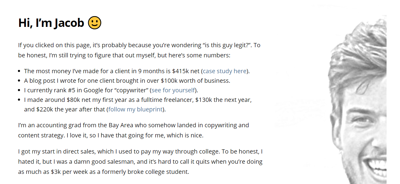
To establish credibility, talk about what you’ve achieved and who you’ve worked with. Here’s a good example from Ryan Robinson:
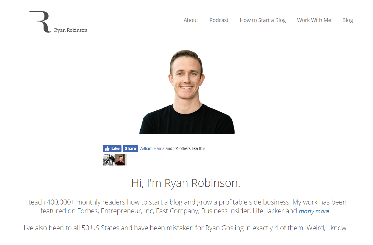
Ryan lets you know really, really quickly that he’s probably worth listening to. Few people can say they have 400k monthly readers, and sites like Forbes, Entrepreneur, and Fast Company don’t just hand out publication placements to everyone.
While I personally think leading with credibility is a great strategy, you can also hit it a bit later on your About page, like this example from Bill Widmer:
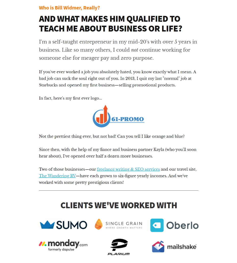
Bill starts his page off with his mission and ethos before divinging into a brand story that also serves to establish his credibility. That’s a great strategy and one you’ll find on a lot of popular websites.
I recently updated my own About page to try and do a better job of establishing my credibility upfront:
To resonate with readers on your core values and mission, all you really need to do is be clear and have an actual mission. This isn’t hard, and to be honest, the only way to fail is to have nothing to actually say.
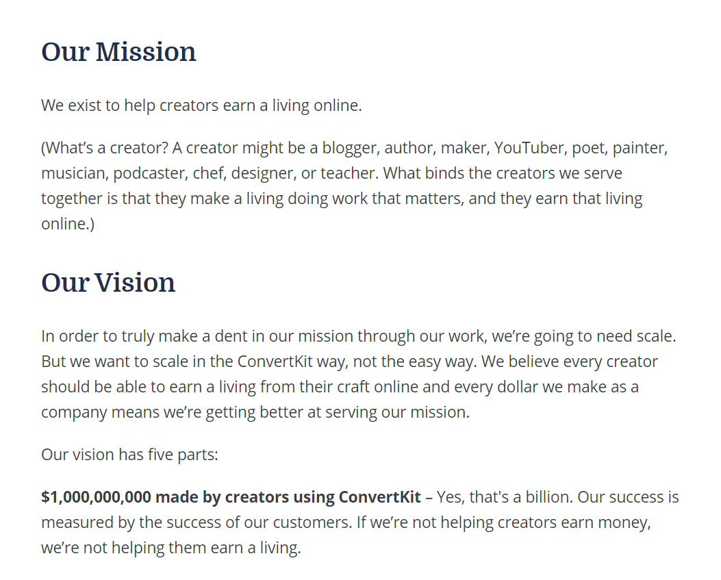
You can be really straightforward and “cards on the table”, like this example from ConvertKit:
Or you can cultivate a “larger than life” image with a little bit of brand mystique, like this example from The Good Trade:
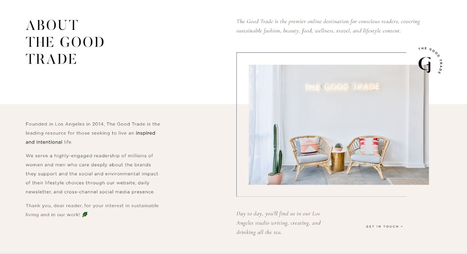
I think taking the mystique or “we’re kind of a big deal” approach is a lot riskier, especially for businesses branded around a person, but for faceless brands, it can be an effective technique.
Whatever you do, DON’T just vaguely copy platitudes from other businesses or write stuff you think people want to hear. It shows… and disengeuity is about the only way to truly screw up your About page.
Always end with a CTA.
Just like every page on your website, your About page should conclude with a call to action (CTA).
What do you want people to do when they visit your website? (Hint: you figured this out earlier in this post)
We don’t stop wanting them to do the thing just because they click over to your About page. So invite them to do the thing.

You don’t need to dedicate an entire section to this like I do. Just make sure there is something there for them to click and a prompt for them click it.
You’ll never believe this, but I put together a live template page for the About page too. I know, right!? So exciting! Click here to access the template.
CHAPTER 5:
How To Write A Service Page
In this section, I’ll be showing you how to create a service page. But more than that, I’ll be showing you how to create a focused landing page that can be used for any singular offer, whether that offer is a service, product, SaaS product, or really anything else.
If your business revolves around a single product or service, you’ll create this page and then make it your homepage. If you offer multiple services, you’ll probably want to have a page like this for each one.
For most service businesses, the primary website goal is to get a contact form filled out, so that’s the goal we’ll be focusing on. That said, you can substitue pretty much any goal into this same page plan and do well.
Let’s dive in.

Open with a great service value proposition.
We’ll follow the same basic formula here that we used for our brand value proposition, but instead of focusing on our brand’s value, we’re going to focus on the value of the specific service being offered on the page.
If you want to really dig into writing a value proposition, click here, but for the purposes of this post, remember that there are three things we would like to accomplish with this value proposition:
- Clearly define the offer
- Specify who it’s for
- Differentiate the value
The first one is absolutely essential. How well we can accomplish the other two will often depend on the service, audience, and what we have to work with.
Here’s one of my favorite examples. It’s a value proposition I wrote for a company called Brillmark.

There’s a few reasons I love using this as an example:
- We accomplished all three objectives.
- We allowed ourselves to use more text than people typically use in the hero shot.
- You know everything you need to know about this company without needing to scroll.
It’s not essential that you get the full elevator pitch in above the fold, but you do want to cover the basics and, at minimum, clearly articulate the offer.
Explain the problem you solve or the benefits you provide.
Once you’ve summarized the offer and value, it’s time to really dig into the weeds and explain that value at a deeper level.
There are typically two different directions you can go with this:
- Dive into the problem or challenge, setting up the solution
- Dive straight into the benefits of the offer
The one you choose will depend on the service, target market, and customer feedback.
Some services are focused on eliminating a very prominent pain point. The problem is top of mind when the customer is searching for a solution, and solving that problem is the motivating factor for making the purchase.
In these scenarios, we want to focus on that problem and how we solve it.
For example, on my content strategy page, I follow up my value proposition by talking about a common pain point for my target market.
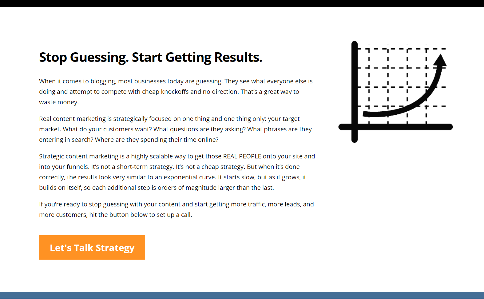
Nobody wants to feel like they are guessing and hoping… but that’s exactly how most business owners feel about marketing. So that’s the pain point I focus on.
You may notice some similarities between this and the brand story we did earlier on the homepage. For service businesses, the brand story and the problem + solution story are often the same.
If we go back to our previous sr4 Partners example, we can see this in action. Once we move past the value proposition, we immediately see their brand story, which is the story of a problem and how they solve it with their service package.
But what if the problem isn’t as prominent?
For other services, it may be less about solving a problem and more about providing a better solution with more benefits.
In these scenarios, you might dive straight into the benefits.
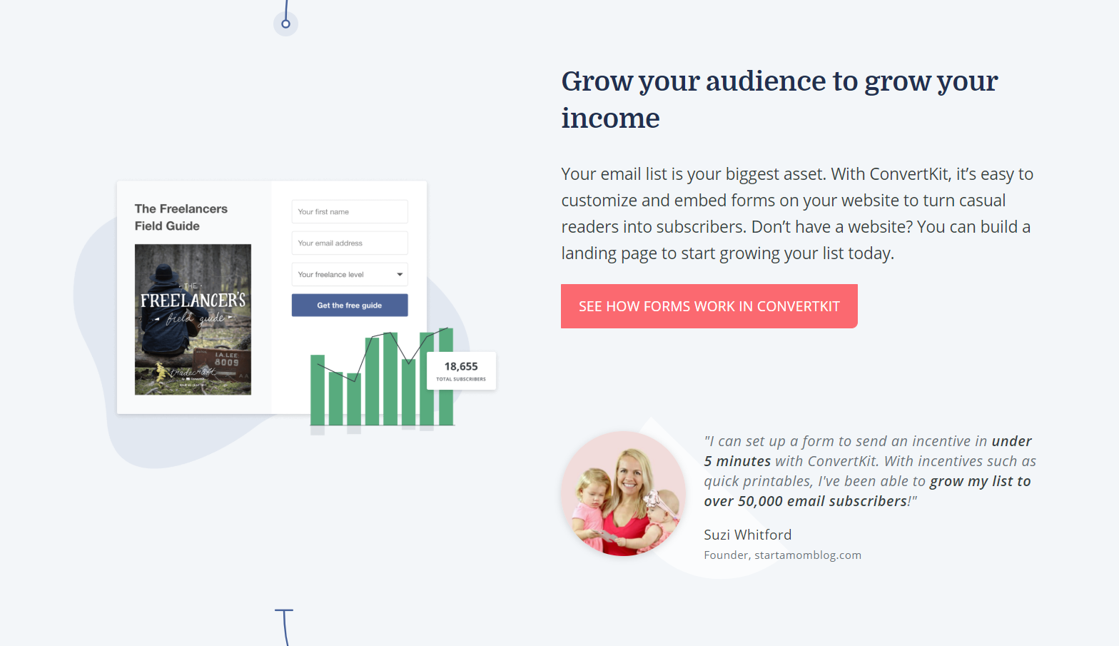
For example, this page from ConvertKit goes from value proposition straight into a reel of benefits-focused sections like this:
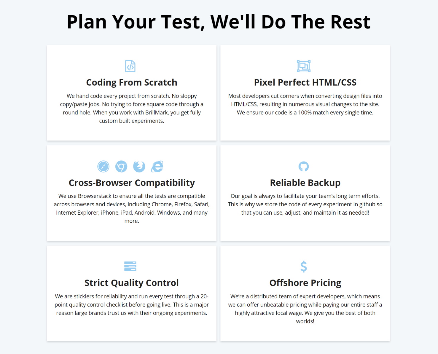
We took this same approach with Brillmark. Once the reader scrolls past the value proposition and first round of social proof, they see the following section, which breaks down six different features of the service that make it best-in-class:
Explain HOW you solve the problem or provide the benefits.
This step is really important, and it’s one that a lot of service businesses leave out. It’s not enough to simply state the problem you solve. You also need to explain how you solve it.
You’re telling potential clients that better organizational health will increase their performance.
Great! How?
How does that work? And more specifically, what does it look like for the client to work with your business and improve their organizational health?
What are the exact steps? What is it going to look like if they choose to work with you?
You want to walk people through the steps from (A) to (Z).
If you look at my website copywriting page, you’ll see this in action:
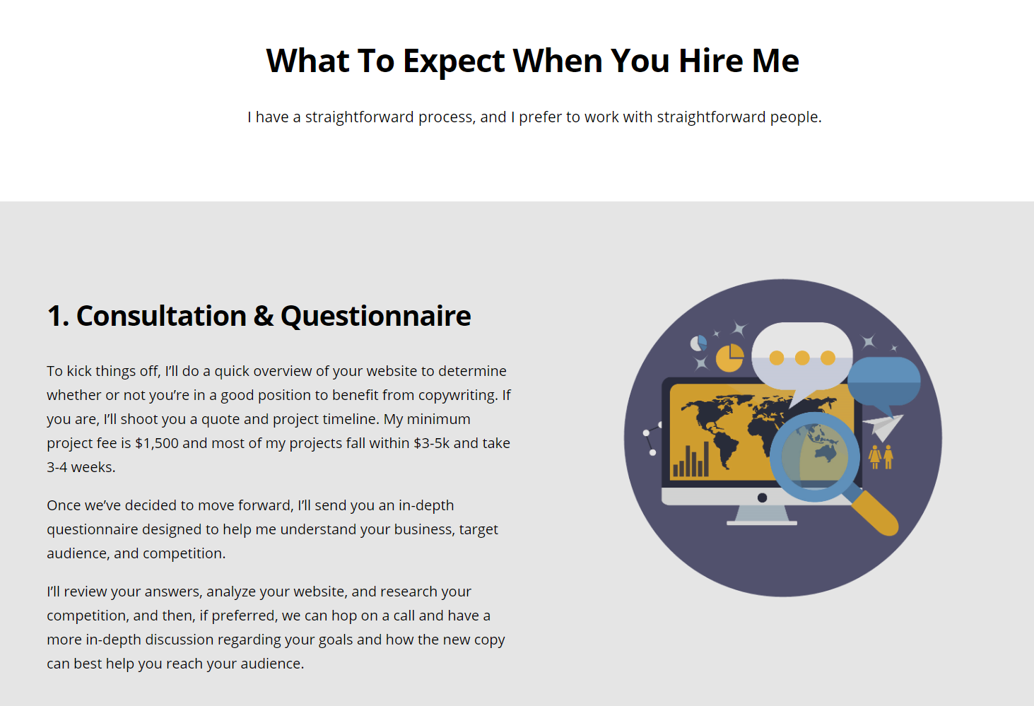
I don’t just tell the reader, “Hey, I’m going to write some words from you, and you’re gonna love ‘em!” I break down the entire experience of working with me, step by step, so they know exactly what to expect.
If you follow up your value proposition with a challenge + solution story, you’ll want to add a distinct “this is how we do it” section afterward.
If you go the route where you dive straight into the benefits, as in the Brillmark example we covered earlier, explaining how everything works tends to happen naturally and will usually happen throughout the benefits section itself.
Just make sure you are diving into how each benefit is achieved, rather than simply describing the benefit.
Provide as much proof as possible.
A lot of people think that copywriting is some form of persuasive voodoo or rocket science. They arrive on these sales pages, feel themselves wanting to buy, and think, “Wow”.
But I’m going to tell you a little secret that does me no favors as a copywriter.
This is something I’ve learned working with clients earning up to $30 Million per year.
Copywriting is really simple, and it has a much smaller role in those persuasive moments than you think.
The true power is in the product/market fit and the proof.
If you are offering something that solves a frustrating problem or delivers a desirable result, you are a third of the way there.
The next third you need is a mountain of proof, whether it’s data, social proof, or both.
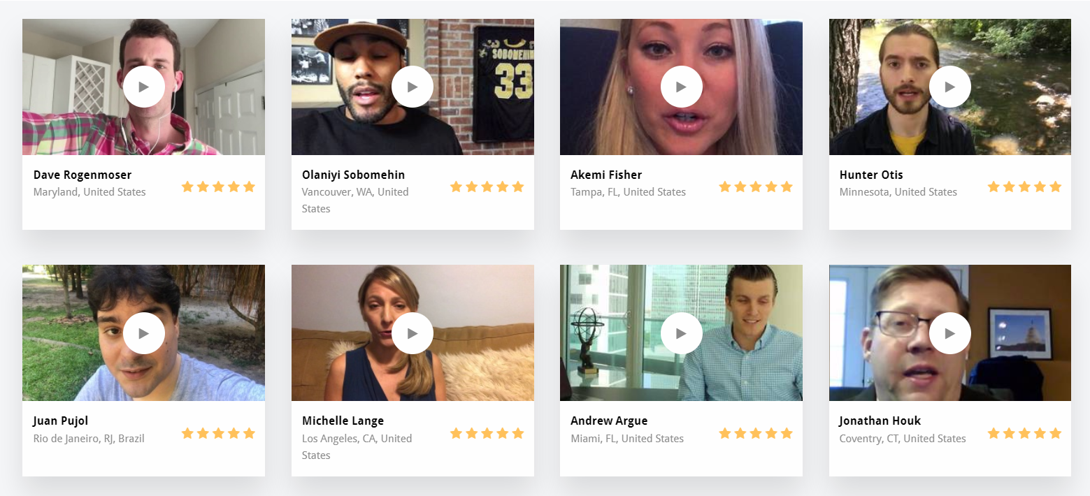
Video testimonials, written testimonials, brand features, news spotlights, podcast interviews, case studies, statistics, revenue numbers, etc.
That’s where the voodoo happens.
The main difference between my client making $300k per year and my client making $30 Million per year is that the latter has a library of 3,000+ video testimonials.
The final third is the copywriting, and it’s the glue that connects everything together and makes it all work. You absolutely need great copy, but it’s only going to unleash the potential of the pieces you’re playing with.
So whether you have a mountain of proof or a small hill, you want to use it ALL throughout your customer journey, including a large helping on your service page, and then you want to do everything you can to go and get more proof.
Push readers toward contacting you at every opportunity.
As we discussed earlier in this guide, you want to include a CTA at any point on your page where the reader might be in the mental position to click.
This could be look like a CTA button at the conclusion of a section. It could look like a fixed header with a CTA button that stays visible to the reader as they scroll down the page. It could also look like a noticeable little bar between sections with a prompt and a CTA button, like the example below:
I like to condense the customer journey into as few pages as possible, so I use CTA buttons to scroll the reader down to an on-page contact form. You can also send readers to an off-page contact form or encourage them to call you.
Just keep in mind that we never want to make it difficult to “do the thing”. The moment the reader decides, “Okay, I’m in”, they should be able to quickly find the button or pathway that takes them to the next step without needing to invest time into searching for it, regardless of where they are on the page.
Be honest… you knew this was coming. I made a live template for the service page as well. Just enter this URL into your browser any time, and you’ll have a visual template with section-by-section instructions to reference as you create high-converting service pages for yourself and your clients. Click here to access the template.
CHAPTER 6:
How To Write A Product Page
When most people seek out copywriting for a “product page”, they are referring to an ecommerce product page like you might see on Amazon, Etsy, or a Shopify store.
So that’s the type of page we’re going to cover in this section.
If you have a product business that focuses on one product (like I do with my comprehensive copywriting course) or a small handful of products, you’ll want to scroll up to the section above and use the format of a service page, which works equally well for selling SaaS or physical products – any scenario where you want to really dive deep into the product story, the problem it solves, or the benefits it provides.
For a more ecommerce style product page, continue reading below.
The best product pages have the following components:
- Product images
- Product details
- “Add To Cart” button
- Product description
- Product or brand story
- “You Might Also Like” section
- Reviews section
For the purposes of this breakdown we’ll be referencing this page from Ugmonk, because it does a great job on each of those components.
Product Images
While this has nothing to do with writing, it’s probably the single most important component of the page, so I wanted to cover it.
There should be multiple, high-resolution images for each product. These images should show off various angles and features of interest. If the images suck, you are going to be fighting an uphill battle with your copywriting.
Product Details
This is more technical writing than copywriting. It’s important to cover all the key details and not leave anything out, particularly anything that browsers will be actively looking for.
A great way to make sure you are covering your bases here is to check your competitors and make a list of every piece of info they included in their details. You should include all the same info as well.
“Add To Cart” Button
This one is pretty straightforward, but make sure the button copy is clear.
Some sites like to get cute and can become confusing in the process. If you are using copy other than “Add To Cart”, make sure it’s really clear that it’s the purchase button.
Product Description
This is your first opportunity on the page to start influencing the reader with your copywriting.
Similar to our service page, we want to explain the product’s value, either by explaining the problem it solves or by highlighting the product’s key features and corresponding benefits.
In our Ugmonk example, we see that they are focusing on features and benefits in the initial product description. Take notice of the following lines:
- “Enzyme washed for added softness”
- “Dye process creates variations of color, making each tee truly unique”
- “Tees are pre-shrunk, [so] they will fit the same [forever]”
Each of these lines describes a feature of the product and then follows it with a description of the corresponding benefit.
This is really important. If the product description just said “enzyme washed”, would you know what that means? Most consumers probably wouldn’t, and as a result, they wouldn’t understand why it’s an important feature.
The format you use here is more flexible. Ugmonk opted to present a short narrative that takes readers through the tee creation process, highlighting features and benefits along the way. Alternatively, they could have simply listed each feature and it’s benefit in a bulleted list.
For products that focus on solving a problem, a short narrative is usually the best format.
Product Or Brand Story
A good product page is designed to give visitors everything they need without scrolling, so we have to keep the product description relatively brief.
Once we have scrolled past the fold, however, we have the opportunity to dive into the product story for the first time or go deeper into the story you touched on in the description
If your product doesn’t really have an interesting story, you can always opt to go with a brand story instead, focusing on what makes your brand unique and why it was created. The reader can then infer that the positives of the brand will translate to the product itself.
Ugmonk really shows us a best-case scenario on this front. Not only do they have a well-produced video telling the story of their product, but they even offer the ability to click over to a full story landing page. What makes this especially powerful is that we are talking about t-shirts here, which are effectively a commodity product, but Ugmonk is removing themselves from the commodity playing field by showing you their unique manufacturing process and it’s benefits.
You don’t have to go this far, but understand that the amount of effort you invest into telling the story of your product will communicate to your customers something about how seriously you take the product itself.
“You Might Also Like” Section
If there is one thing ecommerce vendors everywhere have to thank Amazon for, it’s the “You Might Also Like” section. Amazon titles this “Customers Who Viewed This Also Viewed”, but regardless of how you title it, suggesting additional, complementary or alternative items has become a staple inclusion on every product page.
Again, you won’t be doing much writing here, but whether you are creating your own algorithm for this or using one of numerous available applications to do it for you, getting these suggestions right is important.
Reviews Section
Reviews are your social proof on a product page.
You want as many as you can get and you want them to be descriptive. As people become more and more wise to fake reviews, they are going to increasingly ignore large segments of short 5-star reviews.
This is one area where Ugmonk needs to do some work. They have only one review on this product page, which seems especially weird on a page with its own product story video. My guess would be that this specific tee pack is relatively new and simply hasn’t accumulated reviews yet, but regardless, it’s going to hurt them here.
Since most product pages follow the same, easy-to-visualize template, I decided not to make a live template for this page. Nah I’m just kidding. Click here to access the template.
CHAPTER 7:
How To Write A Contact Page
Last but not least is the contact page.
This is probably the simplest page on your site, and there’s an intuitive reason for that. If someone has clicked on the contact page, they have already decided (or nearly decided) to reach out to you.
Accordingly, you are going to have one of two goals, depending on where your business is at:
- If you want more leads than you’re currently getting, the goal of your contact page is to just get out of the way and let them contact you.
- If you are getting more leads than you can handle, the goal of your contact page is to filter and prequalify leads to save you time in the sales process and to begin onboarding qualified leads.
Let’s dive into what your contact page will look like for each goal.


“I Want More Leads”
This page is going to apply to 90% of businesses, and it’s really, really simple.
We want to do the following:
- Keep everything above the fold (minimal scrolling)
- Include a brief bit of text inviting people to contact you
- Provide as many avenues for making contact as possible (form, email, phone, etc)
- Add a touch of social proof for additional encouragement
That’s it. We really just want to get out of the way and make it as easy as possible for visitors to reach out to us.
Here’s a great example from Brillmark:
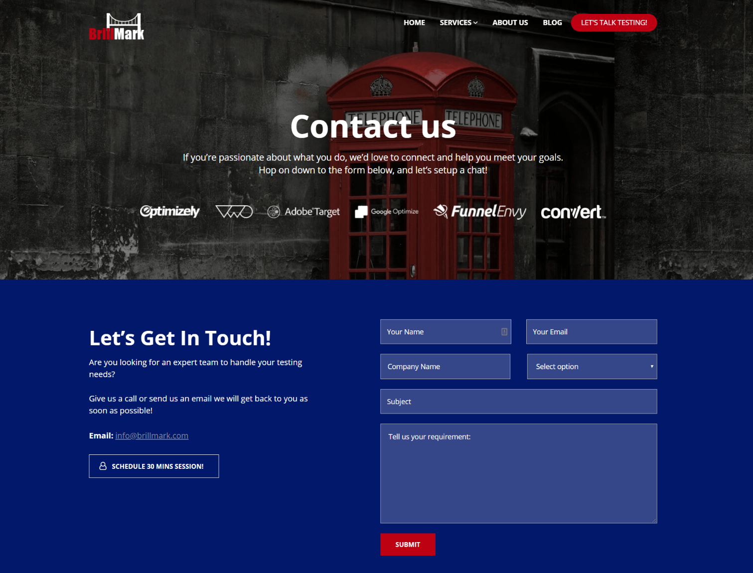
Brillmark does everything right on this page:
- Contact form visible above the fold
- Social proof via brand logos displayed for additional encouragement
- Brief, informative text inviting readers to reach out
- Option included to email directly
- Option included to directly schedule a call
Brillmark not only makes it easy to contact them, they also provide a few different contact options. It’s like giving someone the option to text you instead of call you. That’s going to be a big deal to a segment of your readers.
This is all you need on your contact page if you’re in the “I want more leads” department.
You know I had to do it. This page may be too simple to need a live template, but it takes me like 5 minutes at this point and I want the brownie points. If you like brownies, this one’s for you. Click here to access the template.

“I Have Too Many Leads Already”
Sometimes, you don’t actually want more leads. You already have more leads than you know what to do with, and you’re wasting a lot of your time processing leads you will never even try to close.
This is a great problem to have, and I would guess less than 10% of businesses are dealing with this, but for those who are… it’s a real problem.
If you’re in this boat, your contact page objectives are going to be a bit different:
- Confirm your authority in the eyes of top quality leads
- Prequalify good leads and filter out bad leads
- Begin the onboarding process for good leads
A great example of this type of contact page comes from Michal Eisikowitz. Michal has built such a large following on LinkedIn that she needs to filter leads coming in through her site.
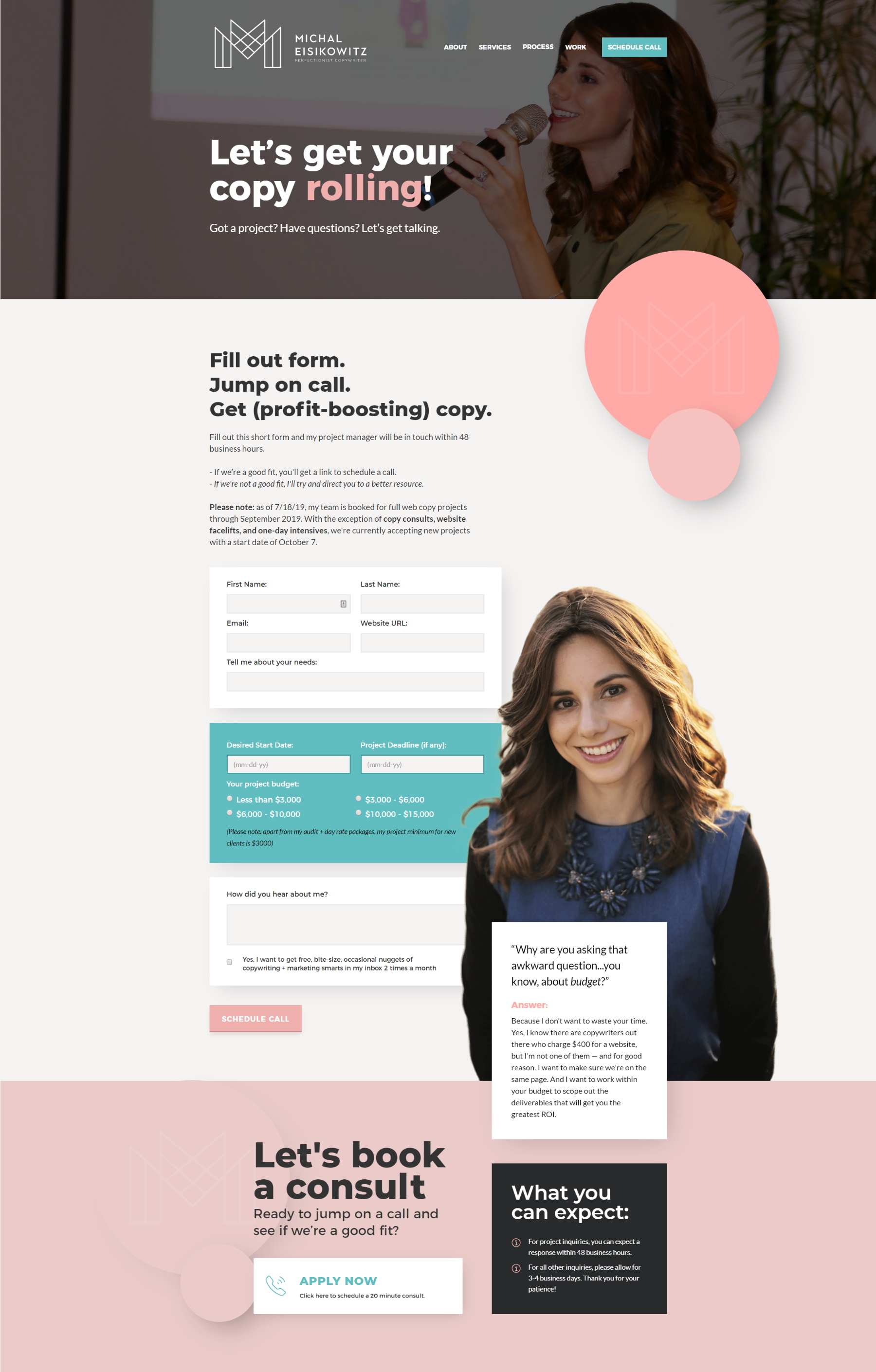
As you can see, she has a few things in place to accomplish the objectives we just listed:
- Photo of her speaking at a conference to add credibility
- Form requesting budget and desired dates
- Text disclosing her project minimum to filter out low-budget projects
Notice that this still isn’t a complicated page, but the goal of this page is to filter leads rather than maximize them, and that’s what you want to aim for as well if you’re in the “I have too many leads” department.
BONUS ROUND:
Live Templates & Walkthrough
As a special bonus, I’ve put together 5 live templates (one for each page type covered in this guide) that you can reference at any time for help with your writing.
These templates look just like a real web page, allowing you to visualize the flow of the page and required sections, but the copy for each section is instruction highlights from this guide.
It’s the perfect website copywriting reference!
If you are the DIY type, I’ve also included a recording of me building a landing page using Divi, the intuitive website builder I used to create this website and this blog post, so you can create your own pages as well.
Click below to grab all 5 templates and the walkthrough:


